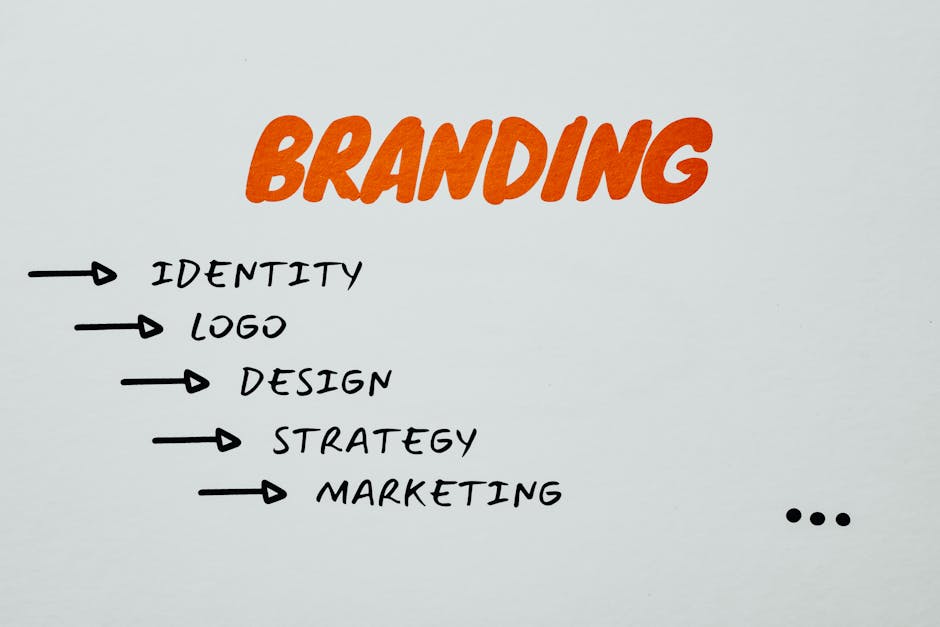
Essential Design Tips For Your Start-up’s Website And Branding
In the world of start-ups, where competition is fierce and first impressions are crucial, a well-designed website and branding can make all the difference. Just as a captivating cover draws readers to a book, an aesthetically pleasing website entices visitors to explore further. But how can you ensure your start-up’s online presence stands out from the crowd? This article will provide you with essential design tips that will elevate your website and branding to new heights.
Like a painter selecting the perfect colours for their masterpiece, choosing the right colour palette can evoke specific emotions and create a memorable visual experience for your audience. Additionally, creating an engaging website layout that is intuitive and user-friendly is essential in keeping visitors engaged and encouraging them to stay longer.
Furthermore, designing a memorable logo serves as the face of your brand, leaving a lasting impression on potential customers. Incorporating consistent branding elements throughout your website reenforces your start-up’s identity and helps build trust with your target audience.
Moreover, optimising for mobile responsiveness ensures that your website looks great on any device or screen size. Lastly, utilising high-quality visuals adds credibility and professionalism to your site.
By implementing these design tips, you’ll be well-equipped to create a visually captivating online presence that not only captures attention but also effectively communicates your start-up’s message to its intended audience.
Key Takeaways
- A well-designed website and branding can make a difference in the competitive world of start-ups.
- Colour palette selection can evoke specific emotions and create a memorable visual experience.
- User-friendly navigation and clear headings enhance the user experience.
- High-quality visuals enhance aesthetic appeal, establish trust, and differentiate start-ups from competitors.
Choosing the Perfect Colour Palette

The selection of an appropriate colour palette plays a crucial role in the overall visual identity and user experience of a start-up’s website and branding.
Colour psychology, the study of how colours affect human emotions and behaviour, is an essential aspect to consider when choosing the perfect colour palette for a start-up’s website. Different hues evoke different emotions and can greatly impact how users perceive and interact with a website.
When selecting complementary hues for a start-up’s website, it is important to understand the desired message or brand personality that needs to be conveyed. Warm colours like red and orange are commonly associated with excitement and enthusiasm, making them suitable for websites aiming to create a sense of urgency or energy. On the other hand, cool colours such as blue and green are often linked to calmness and trustworthiness, which may be more appropriate for websites promoting serenity or reliability.
Additionally, understanding colour theory can help in creating visually captivating websites. Complementary colours are those that lie opposite each other on the colour wheel (e.g., red-green or blue-orange) and can create a vibrant contrast when used together. Analogous colours, which are adjacent on the colour wheel (e.g., yellow-orange), offer a harmonious blend that can evoke feelings of unity.
By carefully selecting complementary hues based on colour psychology principles and incorporating these into their website design, start-ups can create visually appealing experiences that resonate with their target audience. Once an appropriate colour palette has been chosen, attention should then shift towards creating an engaging website layout that complements these selected colours seamlessly.
Creating an Engaging Website Layout

One interesting statistic to consider when creating an engaging website layout is that 94% of first impressions are design-related. This emphasises the importance of investing time and effort into designing a visually captivating website layout. A well-designed layout not only grabs the attention of visitors but also enhances their overall user experience.
To achieve this, it is crucial to prioritise user-friendly navigation. Users should be able to easily navigate through different sections of the website without any confusion or frustration. Clear headings, logical organisation, and intuitive menus can greatly contribute to a seamless browsing experience.
Another essential aspect of an engaging website layout is incorporating effective call-to-action buttons. These buttons serve as prompts for visitors to take specific actions such as signing up for newsletters, making purchases, or contacting customer support. By strategically placing these buttons throughout the website and using contrasting colours or eye-catching designs, users are more likely to engage with them.
To illustrate these design tips further, let’s envision a hypothetical website layout:
| Column 1 | Column 2 |
|---|---|
| User-Friendly Navigation | Intuitive menus and clear headings enable easy navigation |
| Effective Call-to-Action Buttons | Eye-catching buttons with compelling text encourage user engagement |
By implementing these design principles in your start-up’s website layout, you can create an engaging platform that captivates visitors from their very first interaction.
In the next section about designing a memorable logo, we will explore how visual branding elements play a significant role in establishing brand identity and recognition.
Designing a Memorable Logo
Creating a visually captivating logo is an important element in establishing a memorable brand identity and recognition.
A custom logo serves as the face of a company, representing its values, mission, and overall aesthetic. It is crucial to invest time and effort into the logo design process to ensure that it accurately reflects the essence of the start-up.
The logo design process typically begins with brainstorming and conceptualisation. This involves researching competitors’ logos, exploring different styles and trends, and determining what sets the start-up apart from others in the industry.
Once initial ideas are generated, designers start sketching out rough draughts to visualise potential concepts.
After selecting a few promising sketches, designers move on to digitising them using graphic design software. This stage allows for further refinement and experimentation with colours, fonts, shapes, and other visual elements. Creating multiple iterations helps in narrowing down options until a final design is chosen.
In order for a logo to be visually captivating, it should be simple yet unique. Distinctive features enable easy recognition amidst competition while simplicity ensures clarity even at smaller sizes or when printed in black-and-white. Bold colour choices can also make a logo more eye-catching.
Transitioning into incorporating consistent branding elements throughout the website and other marketing materials follows naturally from logo creation as these elements help reenforce brand identity across various touchpoints. By maintaining consistency in typography choices, colour schemes, imagery styles, etc., start-ups can build a cohesive visual presence that resonates with their target audience.
Incorporating consistent branding elements into every aspect of your start-up’s online presence is crucial for establishing credibility and creating an impactful impression on potential customers/clients without overwhelming them with excessive visuals or conflicting messages.
Incorporating Consistent Branding Elements

Incorporating consistent branding elements throughout various marketing materials allows for the establishment of a cohesive visual presence, thereby enhancing brand credibility and leaving a lasting impact on potential customers/clients. To achieve this, it is essential to establish brand guidelines that outline the specific colours, fonts, and imagery that should be used consistently across all platforms. These guidelines serve as a blueprint for maintaining a unified brand identity.
One key aspect of consistent branding is implementing cohesive typography. This involves choosing fonts that reflect the brand’s personality and using them consistently across all marketing materials. Typography plays a crucial role in conveying the brand’s message and evoking certain emotions in the audience. By using consistent typography, businesses can create a sense of familiarity and professionalism.
Another important element of consistent branding is ensuring that all visual elements aline with the established brand guidelines. This includes using the same colour palette across different platforms such as websites, social media profiles, and printed materials. Consistency in visuals helps reenforce brand recognition and makes it easier for customers to identify and connect with the business.
By incorporating these branding elements consistently throughout various marketing materials, businesses can establish a strong visual presence that enhances their credibility in the eyes of potential customers/clients. It creates a sense of trustworthiness and reliability while also making it easier for individuals to remember and recognise the brand.
As technology continues to evolve rapidly, optimising for mobile responsiveness has become increasingly important for businesses. Therefore, after establishing consistent branding elements, it is crucial to ensure that they are adapted seamlessly across different devices.
Optimising for Mobile Responsiveness

To successfully engage and captivate the modern audience, businesses must prioritise optimising their online presence for mobile responsiveness. With the increasing use of smartphones and tablets, it is essential for websites to be designed with a ‘mobile first’ approach, ensuring that they are user-friendly and visually captivating on smaller screens.
One key aspect of mobile first design is creating a responsive layout that adapts to different screen sizes. This involves using fluid grids and flexible images to ensure that content is displayed correctly across devices. Additionally, it is important to consider the placement and size of buttons and links, as well as the readability of text on smaller screens.
Another crucial element in optimising for mobile responsiveness is having a user-friendly navigation system. It should be intuitive and easy to use, allowing users to seamlessly navigate through the website without frustration. A common practise is implementing a hamburger menu ikon that expands into a vertical list of links when clicked on. This saves valuable screen space while still providing access to all pages.
To illustrate the importance of mobile responsiveness in engaging users, consider the following table:
| Mobile Responsive Website | Non-Mobile Responsive Website | |
|---|---|---|
| User Experience | Smooth scrolling and easy navigation | Clunky scrolling and difficult navigation |
| Visual Appeal | Visually captivating design optimised for small screens | Poorly displayed content with distorted images |
| Engagement | Longer visit duration and increased interaction | High bounce rates due to frustrating experience |
Incorporating mobile first design principles and user-friendly navigation are imperative in optimising websites for mobile responsiveness. By doing so, businesses can effectively engage their audience while providing an enhanced browsing experience. Transitioning into the next section about utilising high-quality visuals…
Utilising High-Quality Visuals

Utilising high-quality visuals enhances the overall aesthetic appeal and captivates the audience’s attention, creating a visually immersive experience on mobile devices.
In today’s digital age, where users have shorter attention spans, it is crucial for start-ups to invest in professional photography. High-resolution images not only convey a sense of professionalism but also help establish trust and credibility with potential customers. By showcasing products or services through captivating visuals, start-ups can effectively communicate their brand identity and value proposition.
In addition to professional photography, using infographics effectively is another way to engage the audience on mobile devices. Infographics are visual representations of information or data that simplify complex concepts into easily digestible graphics. Start-ups can utilise infographics to present statistics, explain processes, or highlight key features of their offerings. These visually appealing elements not only enhance understanding but also make information more memorable.
Furthermore, high-quality visuals play a crucial role in creating a strong first impression. When users visit a start-up’s website or social media platforms on their mobile devices, they quickly form judgements based on the visual appeal. A well-designed logo, eye-catching banners, and aesthetically pleasing colour schemes can all contribute to a positive user experience and leave a lasting impression.
By incorporating high-quality visuals into their branding strategy and website design for mobile responsiveness, start-ups can effectively capture the attention of their target audience and differentiate themselves from competitors. These visually captivating elements not only enhance aesthetics but also convey professionalism and build trust with potential customers. Whether through professional photography or engaging infographics, start-ups can create a visually immersive experience that leaves a lasting impact on users’ minds.
Frequently Asked Questions
How can I effectively target my audience through my website and branding?
Targeting strategies and building customer personas are essential elements to effectively reach your desired audience through your website and branding.
By understanding who your customers are, their needs, preferences, and behaviours, you can tailor your messaging, design, and user experience to resonate with them.
Implementing techniques such as personalised content, targeted advertising campaigns, and user segmentation can further enhance the effectiveness of your targeting strategies.
By consistently optimising your approach based on data-driven insights, you can ensure that your website and branding effectively engage and convert your target audience.
What are some common mistakes to avoid when designing a logo for my start-up?
Logo design mistakes can hinder the success of a start-up. To avoid these pitfalls, it is important to follow logo design best practises.
One common mistake is creating a complex and cluttered logo that lacks clarity and fails to communicate the intended message.
Another mistake is using generic or overused symbols that do not differentiate the brand from its competitors.
Additionally, poor colour choices, inconsistent typography, and lack of scalability can also negatively impact the logo’s effectiveness in representing the start-up’s identity.
How can I ensure that my branding elements remain consistent across different platforms and marketing materials?
Consistency in branding across platforms and maintaining brand identity in marketing materials are crucial for a start-up’s success.
This can be achieved by adhering to certain design principles, such as using consistent colours, typography, and visual elements.
Additionally, creating brand guidelines that outline the proper usage of logos, fonts, and imagery can help ensure consistency.
Regularly reviewing and updating these guidelines will also help adapt to evolving trends and technologies while maintaining a cohesive brand image.
Are there any specific guidelines or best practises for optimising my website for mobile devices?
Mobile responsiveness is crucial for optimising websites for mobile devices. It ensures that the website adapts to different screen sizes and resolutions, providing a seamless user experience across various devices.
To achieve this, design should prioritise clear and concise content, easy navigation, and fast loading times. Additionally, incorporating responsive design principles like fluid grids and flexible images can enhance visual appeal and engagement.
By focussing on mobile responsiveness, businesses can effectively cater to the needs of their mobile users while delivering an innovative and visually captivating website experience.
What are some key factors to consider when selecting high-quality visuals for my start-up’s website and branding?
Choosing high-quality visuals that aline with your brand is crucial for creating a visually captivating website and branding.
The juxtaposition of carefully selected images, colours, and typography can effectively convey your start-up’s message and evoke the desired emotional response from your audience.
When selecting visuals, consider their relevance to your brand identity, ensuring they reflect its values and resonate with your target market.
Additionally, choose a colour palette and typography that complement your visuals to create a cohesive visual experience on your website and in all branding materials.
Conclusion
In conclusion, designing a visually captivating website and branding for your start-up is crucial for creating a strong online presence. By carefully selecting the right colour palette, creating an engaging layout, designing a memorable logo, incorporating consistent branding elements, optimising for mobile responsiveness, and utilising high-quality visuals, you can effectively communicate your brand’s message and attract potential customers.
For example, a case study of a start-up that implemented these design tips saw a significant increase in website traffic and user engagement, resulting in higher conversion rates and business growth.
Contact us to discuss our services now!